Notes
Back to articles
We’re Changing our Labels!
When we first introduced our Slivovitz in 2002, it was a pioneer product – both in the quality of the spirit, and in its label alike. We used transparent, self-adhesive film with graphics reduced to the simplest possible form. A fruit symbol, the product name, and Žufánek. The look was unlike any other bottles sold at the time. No folk motifs, no painted cellars, no folk costumes. Just pure and elegant symbols.
But, over time, these simple fruit symbols became a sort of industrial standard, used today by almost every Czech manufacturer of fruit spirits. And so the time was ripe to change the labels.
After 16 years, we are abandoning the fruit symbols, our version of Egyptian hieroglyphics, and are switching to Latin characters.
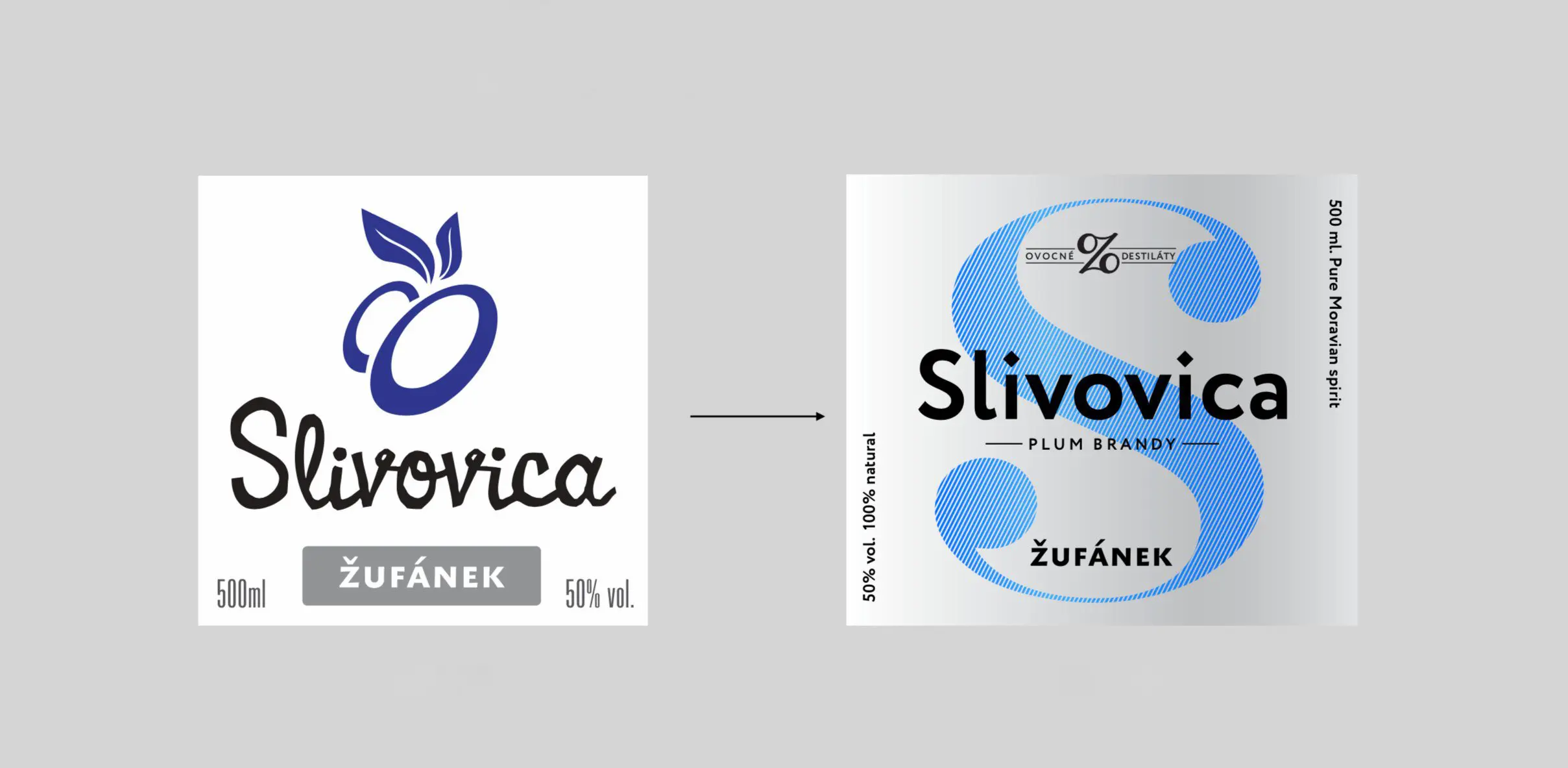
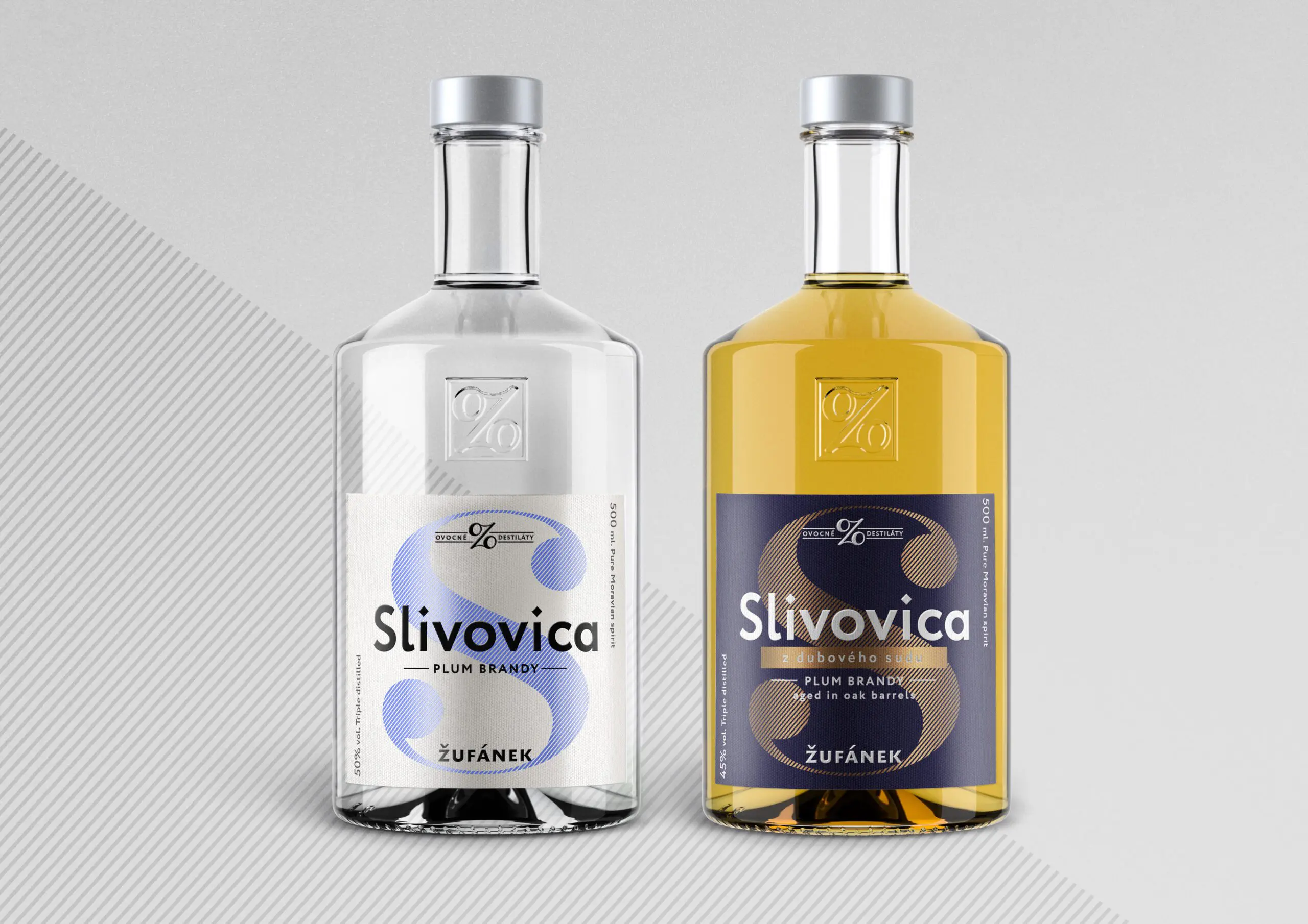
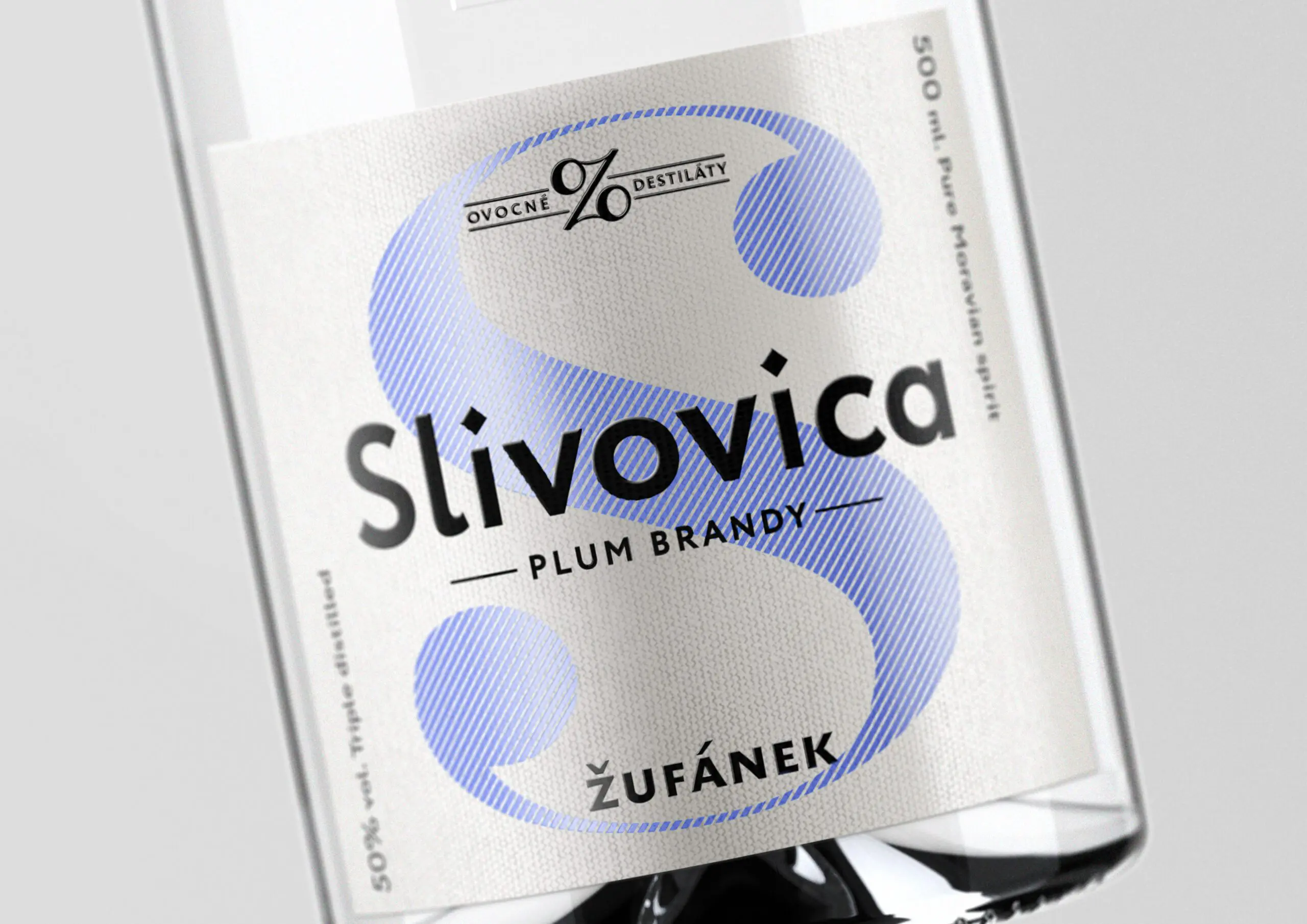
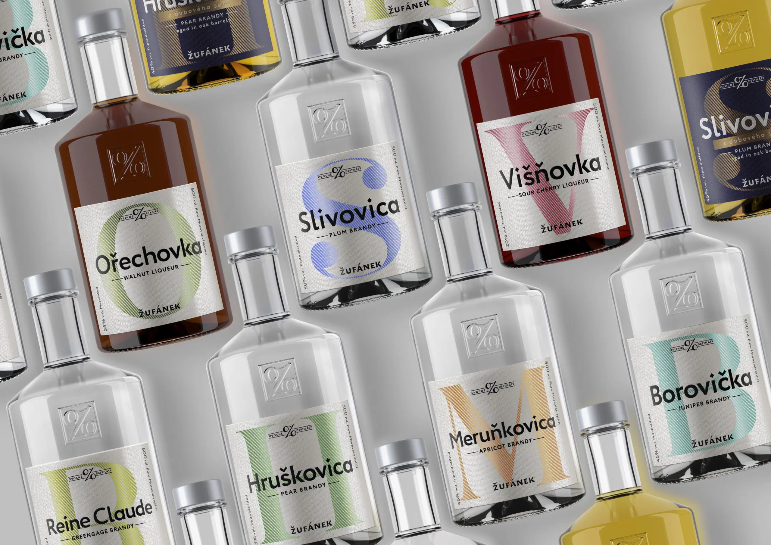
The new labels are more aggressive, more visible, and more comprehensible. Each label is dominated by a letter, seemingly put in quotes. In this way, we are creating an alphabet in addition to our other products. A basic alcoholic alphabet. New call signs. Not Oscar Bravo Sierra for OBS, but Ořechovka Borovička Slivovitz (Walnut Juniper Plum). All Žufánek made, from A to Ž.
Though elegant and attractive, the previous symbols almost ceased to have their distinguishing function. And that’s bad. After all, there are no huge differences between the shape of a plum and a greengage plum. Or between an apricot and a peach. It is different with letters. But we’re not taking any chances, so we’re placing our bets on the primary-signal system – the colours usually associated with the individual fruits. Moreover, with oak-barrel-aged products, inverted colours are used to accentuate the difference.
Above the letter for each product, the labels newly specify the product’s categorisation. We therefore have fruit spirits, fruit liqueurs, herbal distillates, herbal liqueurs, and honey
liqueur.
The product names are also introduced in English – for export. Though the original label for Reine Claude included a greengage symbol, not many people abroad understood exactly what it was.
The design will change in all the basic series, now united by the same graphic style,
comprising our Slivovitz (Plum Brandy), Hruškovice (Pear Brandy), their oak-barrel-aged
variants, Meruňkovice (Apricot Brandy), Reine Claude (Greengage Plum Brandy), Ořechovka (Walnut Liqueur), Višňovka (Sour Cherry Liqueur), Medový Žufánek (Žufánek Honey Liqueur) and Borovička (Juniper Brandy). All other products – absinthes, gins, geists – remain unchanged. The re-design was aimed at refreshing the oldest product series that basically had not changed since 2002.
The new style will be first introduced on our brand new 100 ml bottles, on sale from 23 May 2018, including products we’ve never before sold in small bottles – Borovička, plus Slivovitz and Hruškovice aged in oak barrels. The 500 ml bottles will feature the new style gradually as stocks with old labels sell out.
The challenging re-design was elegantly mastered by Andreea Bora.